Problem Statement:
Work with the 2014 college football dataset from http://www.cs.odu.edu/~mweigle/courses/cs725-s16/passing-stats-2014.csv (original location is http://www.sports-reference.com/cfb/years/2014-passing.html). This is the same data used to create the scatterplot in the d3 example at http://bl.ocks.org/weiglemc/bdc0474429e6567bc320
Part 1 - Tableau
Use Tableau to create the following graphs:
Bar chart of passing yards per player (best displayed as a horizontal bar chart), with conference mapped to color scatterplot of 2 interesting variables, with conference mapped to color one other interesting graph that uses a derived variable For each graph, what insight does it provide?
Part 2 - D3
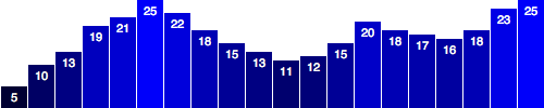
Continue to work through Scott Murray’s D3 tutorial, through “Making a Bar Chart”. The goal is to produce a visualization similar to http://alignedleft.com/content/03-tutorials/01-d3/130-making-a-bar-chart/19.png.
Name: Srinivas Havanur
Assignment: CS 725 - VI2 submission
Course: Information Visualization
Semester: Spring 2016
Comments about using tableau:
Tableau is user friendly tool which has most of the features provided in R and D3 that are required to visualize the data. Simple graphs for instance, average of the statistics in the form of bar graph can be generated within few seconds when compared to R and D3 even if you are not expertized using tableau. This is because all we need is simple skills to drag and drop the appropriate fields from the datasets to generate the graphs.
There is no need to code to produce the visualization using tableau. However, certain complicated operations cannot be achieved using tableau in such cases R and D3 becomes flexible. Sometimes tableau even helped me for exploring to find the quick patterns and then later I coded the same patterns in R or D3 to produce the visualization.
Things that I learn’t using D3:
1.I came to know how to attach the data values to Document object model(DOM) and used svg to showcase the data.
2.Displaying a dataset value in the individual bars of a bar plot using attribute function. Attribute function is used to set an Html attribute and their respective value on an element.
For Eg: <div class="bar"></div> in html can be written as .attr(“class”, “bar”)
3.Applying custom colors by implementing custom function using rgb() color definition.
#1. Bar chart of passing yards per player (best displayed as a horizontal bar chart), with conference mapped to color
a) A Bar chart with grouping by color code: This idea got triggered while discussing ICW2 with my group members.
Incite: Passing yards value for each player is represented in the form of bar graph. Passing yards of each player belonging to same conference are grouped together and represented in the form of color code. From this we can get to know the highest passing yards of a particular player in each conference.

b) A Bar chart with grouping by color code.
Incite: Passing yards value for each player is represented in the form of bar graph. Each player belonging to different conference is represnted in a different color code. From the graph we can get to know the first top five players having highest passing yards.

###2. Scatterplot of 2 interesting variables, with conference mapped to color
Two interesting variables: Passing Attempts, Rushing Attempts
Incite: The main purpose of displaying scatter plot of Passing Attempts and Rushing Attempts is that to find a correlation between two sets of data and how they are linked together. The correlation can be positive when both the values increase together or it can be negative when one of the value decreases as the other increases. In this case we see that there is no correlation between Passing Attempts and Rushing Attempts as the data is scattered all parts of the graph

###3. One other interesting graph that uses a derived variable a) Scatter plot of Completions vs Completion percentage
Incite: Here derived variable Completion percentage is taken into account to generate scatter plot with the pass completions. Completion percentage is calculated by taking a ratio of pass completions by passing attempts. My main purpose was to find the correlation between these two variables. From the graph we can conclude saying that there is a slight low positive correlation between pass completions vs completion percentage.

b) Bar graph of Average completion percentage per Conference.
Incite: I got this idea from the previous graph and was interested to know the average completion percentage values for every conference. From this, we can get to know the particular conference that has the highest average completion percentage.
