In response to this stack overflow question
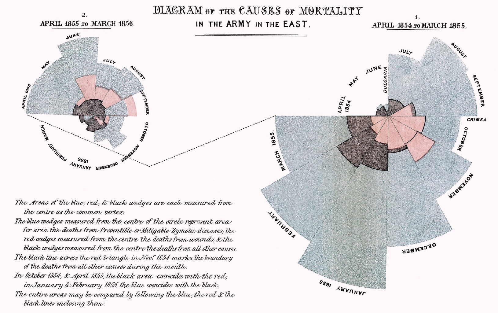
This type of chart is also sometimes known as a sector diagram. The most famous example of a similar layout is probaly Florence Nightingale’s “coxcomb” diagrams though in her version the sectors aren’t stacked, they’re all measured form the center and the areas are proportional to values not distances (I was too lazy to calculate those).
This isn’t a great visualisation as it stands: The data values are proportional to the thickness of the arcs rather than their area giving values appearing later in an array undue visual weight. In order to do a better job you’d need to work out the appropriate area for a given segment then work backwards to determine it’s thickness given where it starts (radially speaking). This is left as an excercise for the reader.